Portland Timbers New MLS Crest Turns Into PR Disaster For Club
How important is your team’s crest to you? Would you care if they changed it? If there was to be a change, would you only want it to be a modernisation (ala Aresnal and Juventus), a complete change or should history be preserved and no tinkering done?
With regards to East Fife, we had an enforced change before due to copyright reasons. I like the current crest, but we’ve had debates on AFTN before as to whether we should change it? In all honesty, I don’t really care one way or the other.
I’m not that attached to it and it’s not as if we’ve had it since we were formed in 1903. If we were to change, I’d like to keep the saltire in it, but apart from that, I’d be happy with pretty much anything. Or at least I think I would be! I just don’t put a lot of onus on it as a deal breaker in whether I buy Fife strips etc and I can’t see me ever falling out with the Club about it.
Club crests and logos are a big deal in North America though, especially when it comes to new teams starting out. A bad logo or hideously unpopular crest can kill a club, with merchandising opportunites greatly reduced.
Last week’s blog covered the launch of Vancouver Whitecaps new club crest for their forthcoming Major League Soccer inaugural season. I like it. It’s definitely a grower and once you see it on strips, scarves and more, it’s pretty sharp and distinctive.
Portland Timbers, the 18th expansion side to go into MLS, also next season, had launched a slick video campaign in the build up to the launch of their MLS club crest.
They seemed to have done everything right, they seemed to ‘get it’ when it came to the Club’s proud history that dates back to 1975, a year after Vancouver Whitecaps. They’d had discussions with the huge Timbers Army supporters group and in September last year, owner Merritt Paulson was quoted as saying:
“I want to briefly clarify a discussion that took place yesterday between the TA and the FO reps concerning a new team logo for MLS.”
“At the outset, I would say that our logo in MLS should unequivocally not be exactly the same as it is in USL-1. We are making a move to major league. This is not simply a Championship League team being promoted to the EPL…The franchise is being elevated and significant change will be taking place (in a good way) on many levels. A new logo is critical to represent that change.”
“However, the Portland Timbers are not the typical USL-1 team, our history is not the typical pro U.S. soccer team history and you are not the typical fans. We recognize the need to pay significant homage to our past.”
“As this relates to logo/colors etc: simply expect evolution, not wholesale change. We will not get this wrong. Trust me.”
Those last two sentences are now coming back to haunt the Timbers front office. The Portland fans don’t just HATE their new crest, the absolutely DETEST it.
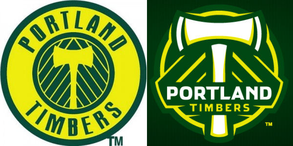
Now before we go any further, here’s the current crest on the left and the new MLS adaptation of it on the right:

What’s your thoughts on them? Which do you prefer and why?
Portland’s FO were so confident that the crest would be well greeted that they decided to launch it to thousands of people at half time of an open air showing of Saturday’s US-England match.
Big mistake to say the least.
The crest had been leaked in the days leading up to the launch due to the fact that tshirts bedecked with the new MLS crest had been sent out to Dick’s Sporting Goods for sale and somehow, people had got hold of them before the official launch day according to the Timbers Soccer City forum – a thread which incidentally has 84 pages to it at the time of writing this!
The unveiling was met by some cheers and polite applause, but these were soon drown out by boos and chants of “it’s so shitty it’s unbelievable” and “you fucked up”.
You can view video taken at the event below:
[youtube http://www.youtube.com/watch?v=LaVsiCIEMEo&hl=en_US&fs=1&color1=0xe1600f&color2=0xfebd01]The reaction hasn’t gone down well with the Timbers and has strained relationships between the Club and fans, not an ideal situation when you’re trying to launch your new “product”.
The crest and the fans reaction to it is also likely to be the subject of ridicule from the Vancouver Southsiders and Seattle’s ECS both now and when the teams meet next year. Once you know the fans don’t like something or someone then you have to play on that.
Now some, outwith Oregon, may wonder just what all the fuss is about as I mentioned at the start of this piece, but the thing is that the crest meant a LOT to the Timbers Army and they told their Club that. This seemingly counted for nothing.
For what it’s worth as a neutral, I don’t think it’s too bad. At least on some items. There’s an embroidered patch of it on their website that looks pretty smart. On the other hand it looks dreadful, cartoony and like two bones as opposed to an axe on the tshirts, the definition of the green on the axe head appears to be the major problem. On other merchandise their once mighty axe has been reduced to looking like a hatchett.
So as we thought all along, the Timbers Army have tiny choppers.
